I'm a software engineer. My design taste is bad. Every side project I shipped before last year looked like the same abandoned SaaS template: Inter, gray-to-white gradient, three feature cards with Heroicons, a purple button somewhere.
I never cared enough to fix it. Then I started shipping more side projects. At some point the landing pages started embarrassing me.
What actually changed
The thing that changed is not "AI draws pretty pictures." Claude Code can produce something perfectly passable on the first try. But passable looks the same across every project, and passable is exactly the problem. The default output from any model trained on the modern web is a beige SaaS dashboard.
What I learned is how to steer. I can't hold a design direction in my head on my own. I can't look at an empty page and know what it should feel like. But I can recognize when something is wrong, I can point at a reference and say "more like this," and I can commit to a direction once I've stumbled into one. That turned out to be enough, as long as the tool in the loop is patient and cheap to iterate with.
Here's the workflow I've settled into across four side projects: WhatIsThatBook, DishCost, naps.sh, and Threadcast. WhatIsThatBook is the one I'm most proud of, so most of the examples come from there.
Start with zero direction
My first prompt is always dumb. "Build a landing page for this app. Here's what it does."
I don't give a color palette. I don't name a vibe. I let Claude do whatever it wants to do by default. Then I look at it.
The first draft is almost always generic. That's fine. It's the design brief. Whatever I don't like about it is the shape of the thing I do want. If the hero is teal, I know I don't want teal. If it's a three-column features section, I know I'm already tired of three-column features sections. Reacting is so much easier than generating.
Almost every productive design direction in my projects has come out of the moment I look at a first draft and go "not that."
Zero design direction. Clean, forgettable, interchangeable with every other personal site.
Push past generic with /frontend-design
Once I know what I don't want, I call in the /frontend-design skill. It's a Claude Code skill that explicitly tells the model to avoid generic AI aesthetics, commit to a bold direction, use editorial typography (Playfair Display, Instrument Serif, not Inter), and treat the page as a crafted object rather than a layout.
This is the single change that did the most for my output. Before /frontend-design, every project looked like Linear. After, each project has its own identity.
I'll paste the actual moment from a recent naps.sh session, because it's a better illustration than anything I could say:
i don't like that cream background
@kb/design/

could we have another approach?
Claude tried. I wasn't sold. Two minutes later:
hmmm
no

you know what

let's reimagine a whole new version of the design
don't care about what's currently there

use /frontend-design skill
That's the whole prompt. Claude did a complete reimagining, from a cream-background / soft aesthetic to a dark researcher's-desk aesthetic, and the new version was miles better. I didn't write a brief. I didn't describe colors. I said "use the skill" and reacted to what came out.
Name a physical metaphor
For projects I care about, I add one more thing: a physical reference. Not a mood board. One sentence naming a real-world object or space.
WhatIsThatBook is the clearest example. The app helps people identify books they half-remember. They describe a plot, we surface candidates. I told Claude: this should feel like walking into a dusty indie bookshop. Warm creams, burgundy accents, serif typography, maybe a bookshelf for the nav.
That was enough. The nav turned into book spines. The loading state became a bookmark sliding. The 404 idea ("lost in the stacks") fell out almost on its own.
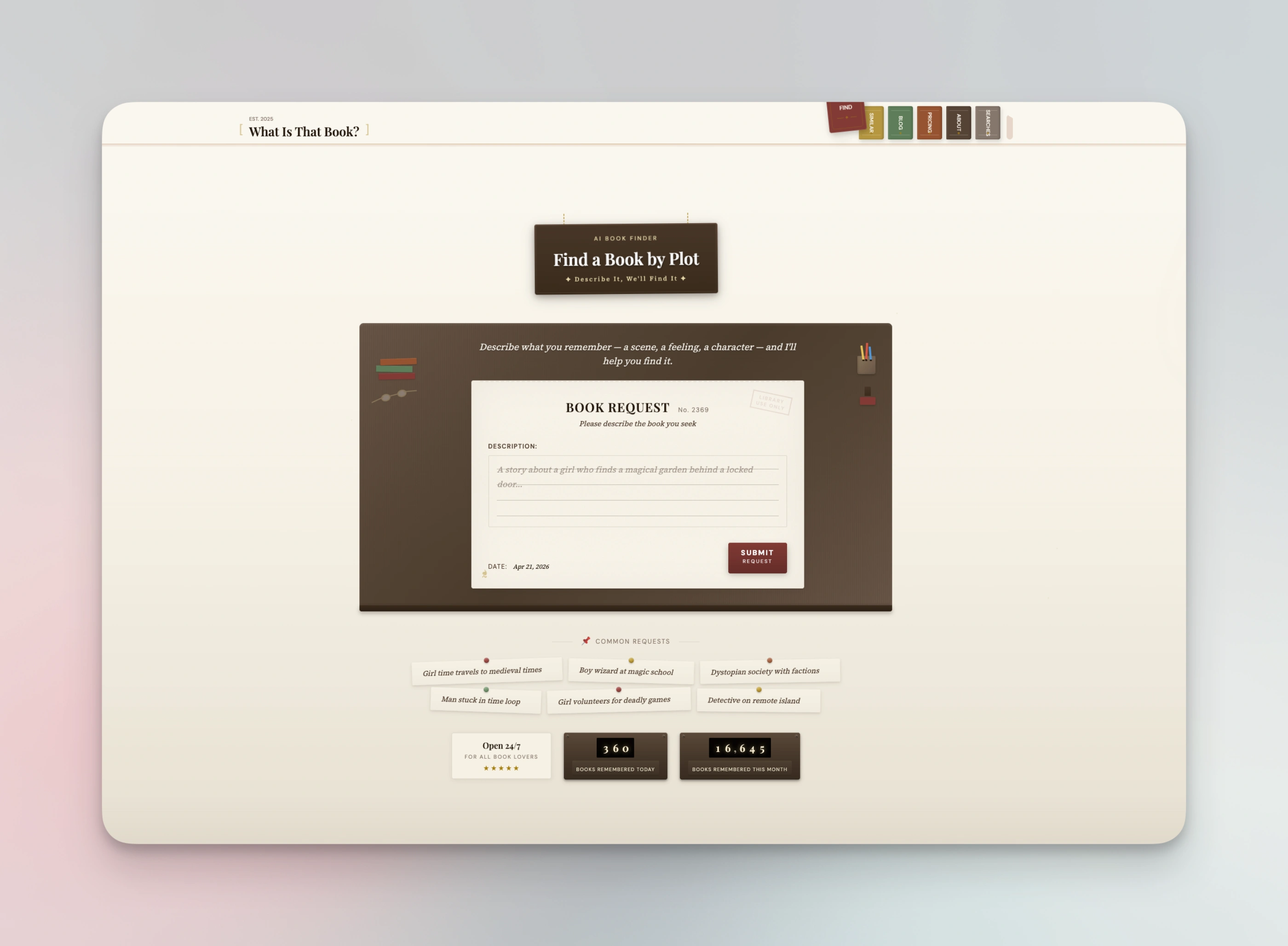
The nav is a row of book spines. Hovering one pulls it forward.
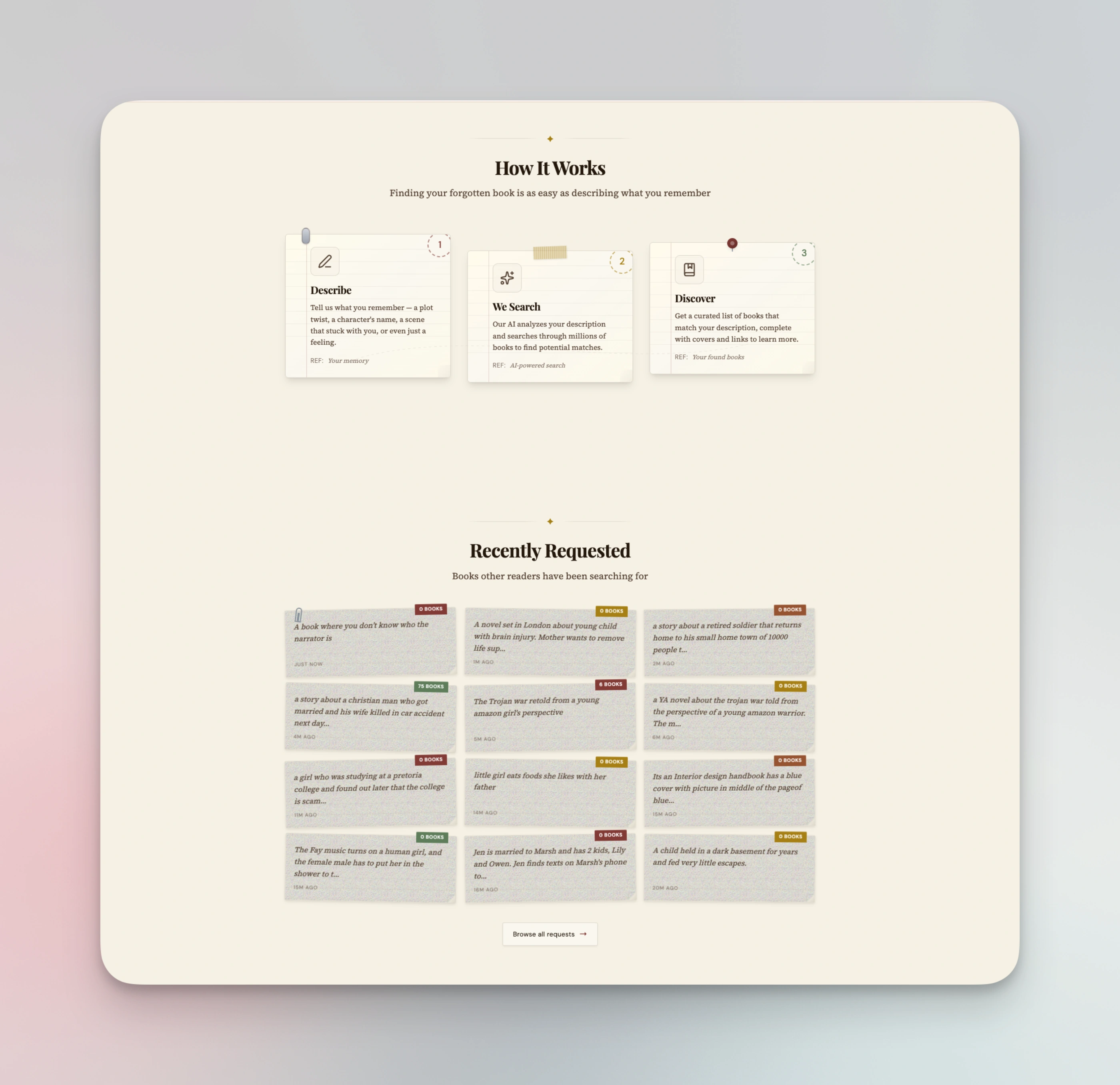
"How it works" is a card grid on every other site. Here it's index cards pinned above the shelf.
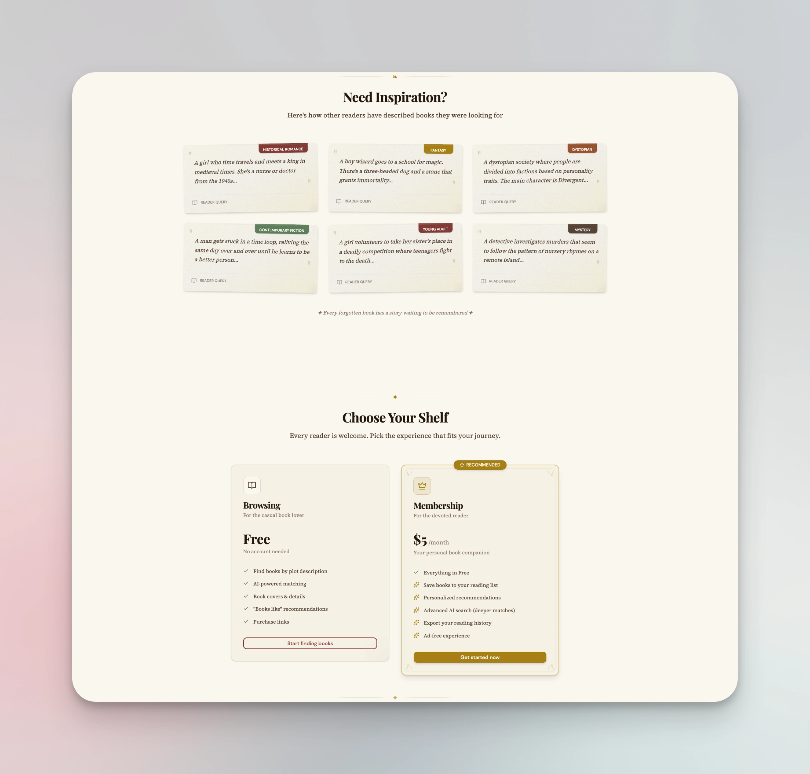
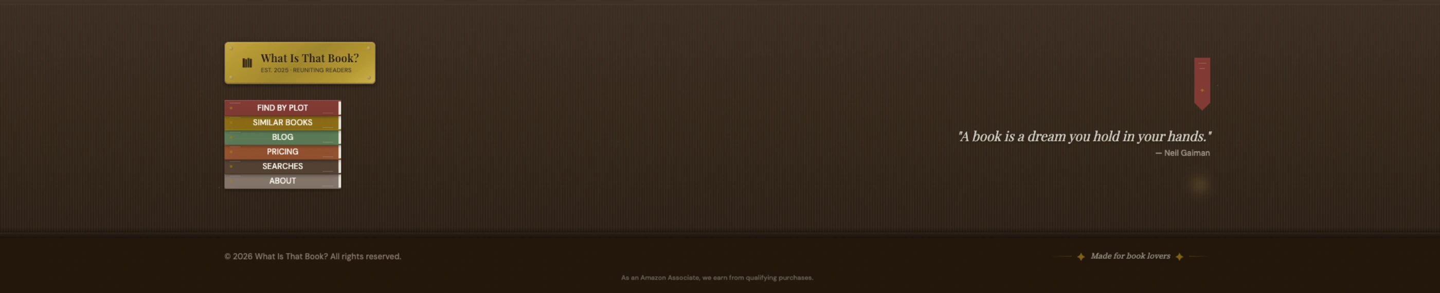
Pricing tiers renamed as shelves. Tiny change, totally changes the feel.
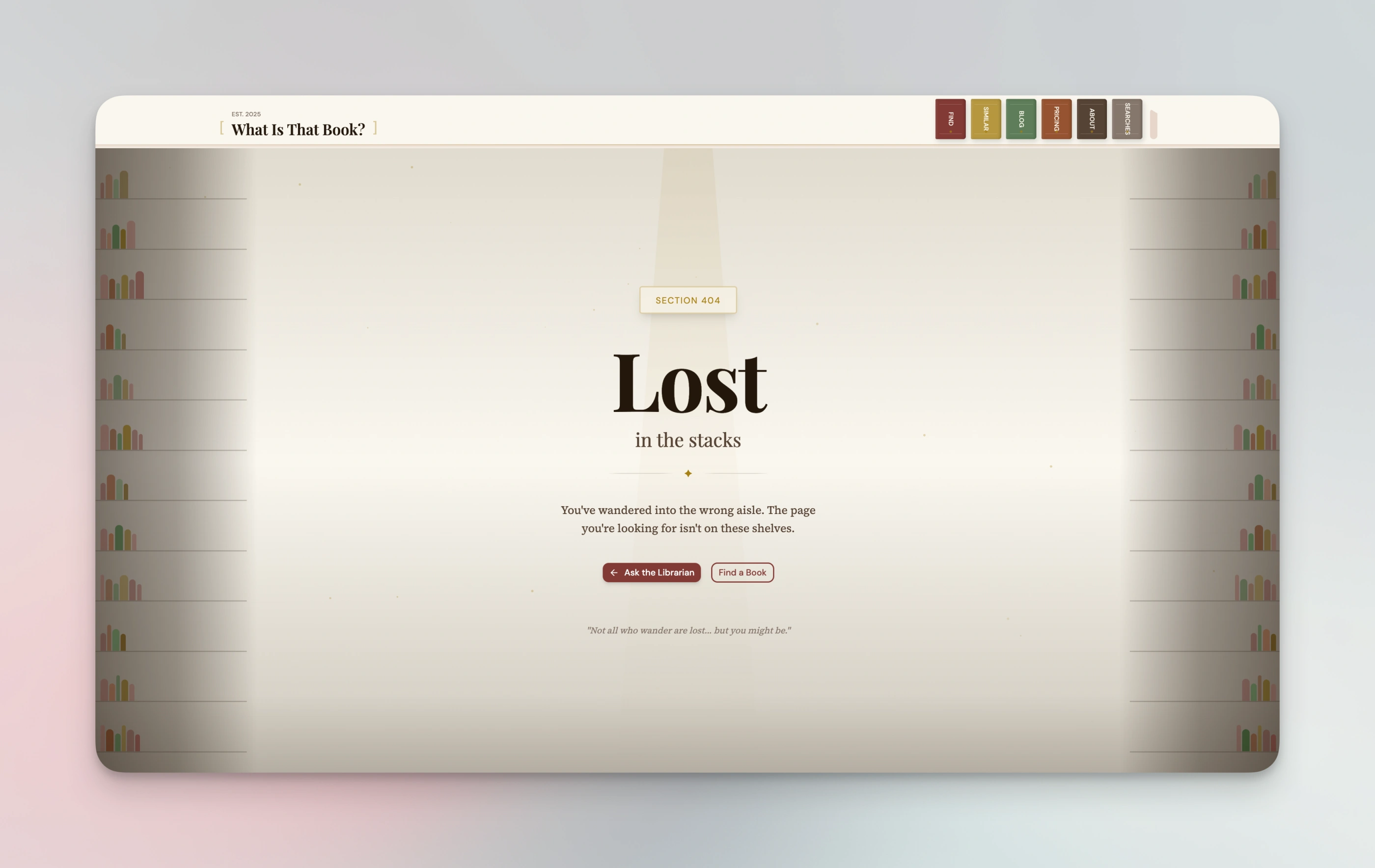
I didn't ask for towering bookshelves on the 404. Claude did, once the metaphor was in the system.
The brass plate, the peeking bookmark, the Gaiman quote. None of it was in the brief.
DishCost got "a chef's line prep sheet — clipboards, ticket paper, terracotta, sage." naps.sh got "a researcher's desk after hours." (The backend story of naps.sh is a different post.) Threadcast got its own direction too. Each project now has a distinctive identity I can describe in one sentence, and that sentence does more work in every future prompt than any color palette could.
The metaphor is the thing that keeps every subsequent design decision in a lane. Instead of asking "what should this button look like," I can ask "what would this button be in a bookshop." That's a much smaller question.
Lock it in with guidelines files
Once a project has a direction I like, I ask Claude to write it down. Every project of mine now has a kb/design-guidelines.md file. For the ones I care about most, I also have a kb/extraordinary-design.md.
The first file is the mechanical stuff: palette, typography, shadcn variants, decorative symbols. The things Claude needs to reproduce the look without thinking about it. The second file is the philosophy. The "why." Here's a piece of WhatIsThatBook's extraordinary-design.md:
### 1. Find the Physical Metaphor

Before designing any component, identify a real-world object that matches your brand:

| Instead of...   | Think...                        |
| --------------- | ------------------------------- |
| Navigation menu | Bookshelf with book spines      |
| Mobile drawer   | Library card catalog            |
| Buttons         | Bookmarks, stamps, wax seals    |
| Cards           | Index cards, book covers        |
| Loading states  | Page turning, bookmark sliding  |
| Empty states    | Empty shelf, blank journal page |
The prompt that produced the first version of this file was also basically nothing:
cool
create in kb folder a design folder
with file(s)
explaining our design philosophy, guidelines, etc...
and in claude.md mention that all new uis should respect that
Claude wrote a draft. I nudged a few sections. Shipped. The actual files for WhatIsThatBook are on a gist if you want to steal the structure.
Having the file matters more than the file being perfect. The point isn't to produce a design system. The point is to give the next session something to read that isn't my brain.
Reference the guidelines in every future session
This is the part that makes it compounding. Once those files exist, I reference them at the top of every design session:
let's build the /about page
keep in mind @kb/design-guidelines.md @kb/extraordinary-design.md
The design doesn't drift. New pages feel like the same site. Three months from now, when I come back to add a feature, the next Claude session walks into a project that already has an opinion.
This is where CLAUDE.md earns its keep. Mine tells Claude to read those files whenever it's building or updating UI. So I don't even have to remember to reference them. They're structurally part of every design turn.
A trick I like: screenshots as HTML
When a landing page needs a product screenshot (a feature card, a demo image, a before/after), I don't take a real screenshot. I have Claude design the screenshot as inline HTML in the page itself.
Claude already knows the codebase. It knows the colors, the components, the typography. A screenshot-as-HTML stays in sync with the brand automatically, and Claude adds texture details I wouldn't have thought to add: a fake cursor, a subtle toolbar, a dog-eared corner, ambient noise on the background. The "screenshot" becomes another piece of designed surface instead of a rectangle with a PNG inside.
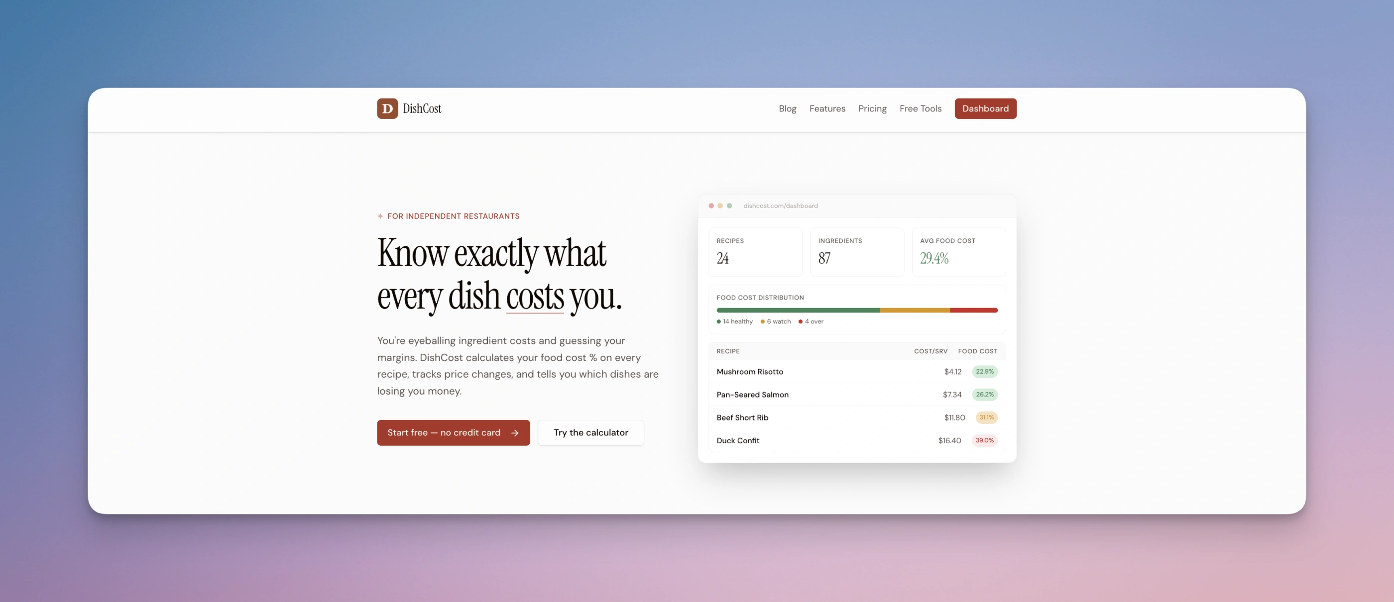
The dashboard on the right isn't a screenshot. It's HTML rendered inline, in the same codebase as everything else.
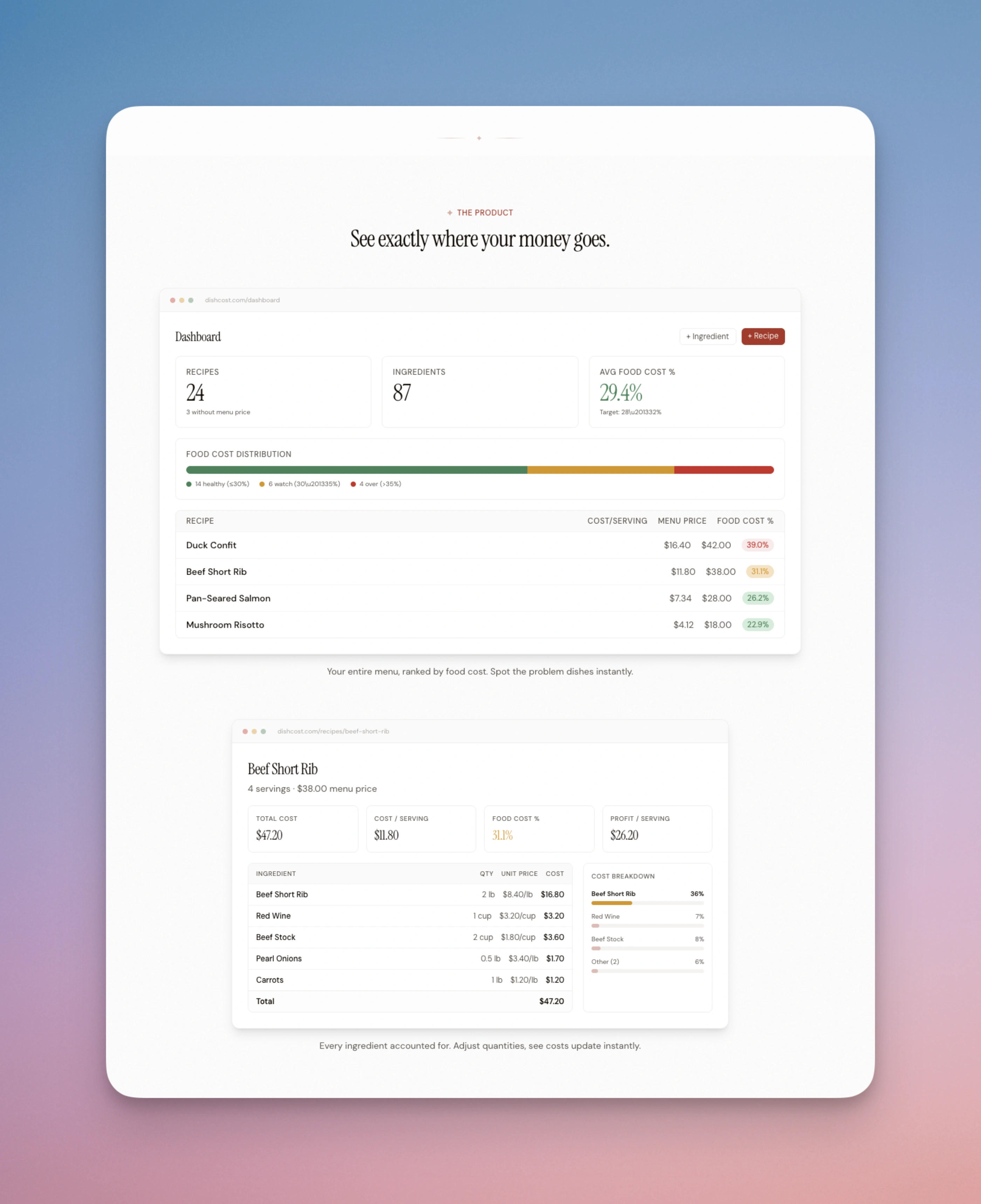
Same trick, more views. When the product UI changes, these update automatically.
It also dodges the thing I used to hate most about landing pages: redoing the screenshot every time the UI changed.
What I've tried that didn't stick
I spent a while with the impeccable.style skills. They're really good, especially for critique and for understanding what makes a design feel expensive versus cheap.
But I don't call them directly anymore. What happened is I read them, internalized what they were teaching, and now I bake those principles into my own CLAUDE.md and my design guidelines files. I get more mileage from the learnings than from the skill invocations, because the learnings are present in every session while a skill is only present when I remember to call it.
Same pattern with /teach-impeccable. I ran it once, absorbed what it was asking, and now I encode those answers into the project from the start.
I'm still figuring this out
This is not a finished workflow. I change something about it every few weeks.
Recently: moving the physical-metaphor decision to the very first prompt instead of the third or fourth iteration. Before that: splitting design-guidelines.md from extraordinary-design.md so the mechanical pieces and the philosophical pieces have different homes. Before that: starting a project by cloning the design scaffold from a previous one, which turned out to be the wrong move.
Every project needs its own identity or it defaults back to "the same site I made last time."
The thing I'd tell you if you're a software engineer with bad taste who wants to ship side projects that don't embarrass you: you don't need to develop taste in the abstract. You need a tool that's willing to propose ten directions for you to react to, and a habit of committing to the direction you stumble into.
The taste part is reacting. Claude Code does the generating.
I'll keep experimenting. If I find a better workflow, I'll write another one of these.